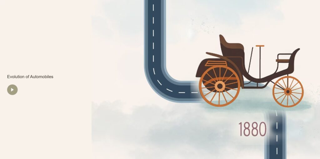
The overall visual structure of the website is minimalist and user-friendly. The layout uses
negative space effectively to separate content. Navigation is intuitive, and transitions between
sections are smooth and logically ordered. I chose a consistent and neutral color scheme that
complements the visual elements without overwhelming them.
What could be improved
While the website structure was clean, there were limited interactive or animated elements to
fully showcase multimedia capabilities. In hindsight, incorporating short animated sequences,
scroll-triggered effects, or hover states could have added depth and engagement.
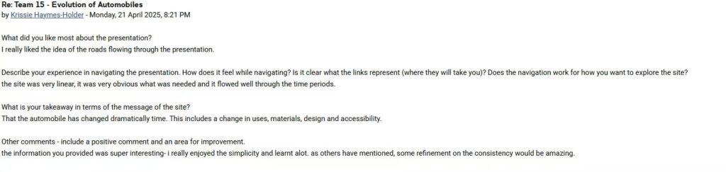
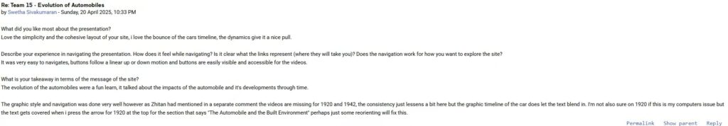
A recurring point of feedback was the inconsistency in content format, especially for the 1920
and 1942 sections, where videos were missing and replaced with static text. Additionally, some
users noted overlapping text and layout issues in particularly on smaller screens or when
interacting with certain elements like the arrow buttons.
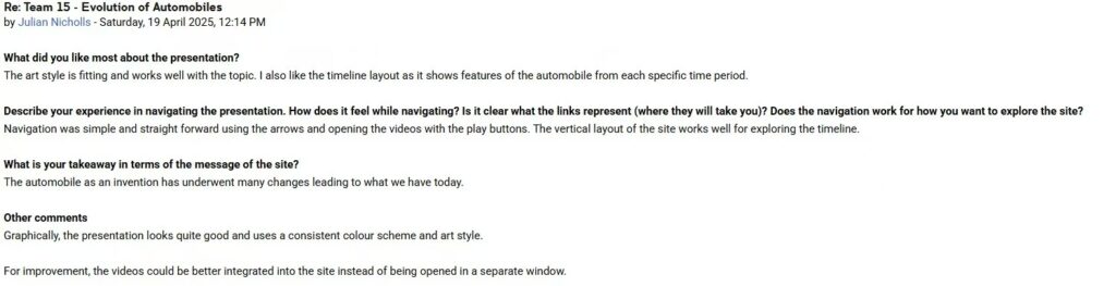
Another suggestion was to embed videos directly into the site instead of opening them in a new
window. This would make the experience more seamless and keep users engaged within the
flow of the site. More interactivity, such as clickable popups or animations triggered by scrolling,
was also recommended to sustain attention and reduce the monotony of static text.
Learning Insights
I gained a practical understanding of user experience (UX) design, particularly how to structure
content flow and manage cognitive load. I also learned the importance of visual hierarchy and
the role typography, spacing, and interaction play in directing attention.
Throughout this process, I developed a stronger sense of how to communicate visually using
digital tools. I also realised that simple does not mean less effective, where this idea isemphasized in Architecture “Less is more”, in fact, minimalism often amplifies clarity and