What Worked Well:
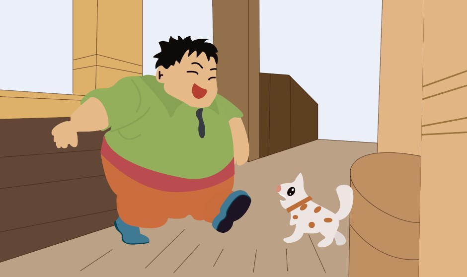
The colour palette I chose was vibrant and playful, which worked especially well in aligning with
the theme of “stars.” From my understanding, this theme is often associated with children’s
stories or educational material, and I wanted the visual tone to reflect that sense of wonder and
simplicity. The bold colours helped draw attention to key elements which was also supported by
the form and storytelling, following a clear, child-friendly rhythm, recognizable shapes, and a
gentle narrative.

What I Would Do Differently:
Technically, my symbol organization were inconsistent, which created confusion as the timeline
got more complex. This affected the speed and efficiency of my workflow. I also realized
post-submission that some motion easing could have improved the fluidity of the animation,
especially in emotionally loaded scenes. If I had more time, I would experiment more with sound
design, interactive triggers, and visual effects like transparency or blur to enhance mood.

Broader Reflection:
Through this task, I began to see clear parallels between animation and architectural
presentation. Both rely on sequencing, hierarchy, and experiential flow. What I learned here is
applicable to how I might present spatial narratives in architecture—guiding the viewer’s focus,
layering and evoking emotion through multimedia.
The animation process deepened my understanding of cognitive load management by keeping
visual elements minimal and structured, I ensured users could focus without feeling
overwhelmed. This directly reflects Mayer’s principles in multimedia learning.